NadavSimhi Made byUnpluggedClient2025-2026RoleUX / UI Designer
Unplugged · UnpluggedOS

Unplugged's UP Phone
Setup & Onboarding

Designing the first-run setup and cross-device migration for UP Phone, a privacy-first smartphone, so people can switch and start using it without losing their data, or their patience.

Start the tour →
[ Navigate with left and right swipes ]
UP Switch
Welcome to UP Phone
[Design Challenge]

Switching daily-drive device is a big move: you carry years of data, contacts and habits from your old device. Setting‑up, settling‑in and transferring your data are the key factors of the first impression by the user.

[Goals]
  • 01
    Fewer returns. Kill every dead-end and moment of doubt in the first hour.
  • 02
    Fewer support calls. Make each step explain itself, no human required.
  • 03
    Trust from the first tap. Show the privacy promise; don't just claim it.
[The Output]

Welcome App

First-boot device setup and setting choices.

UP Switch

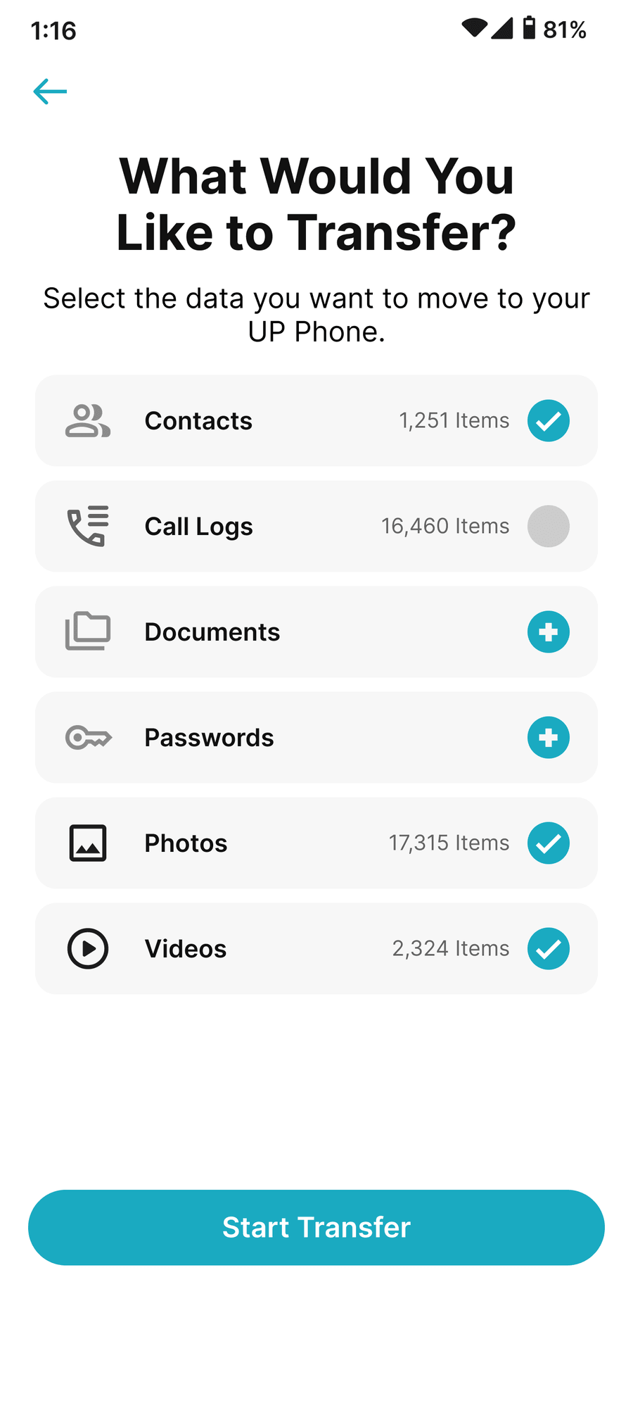
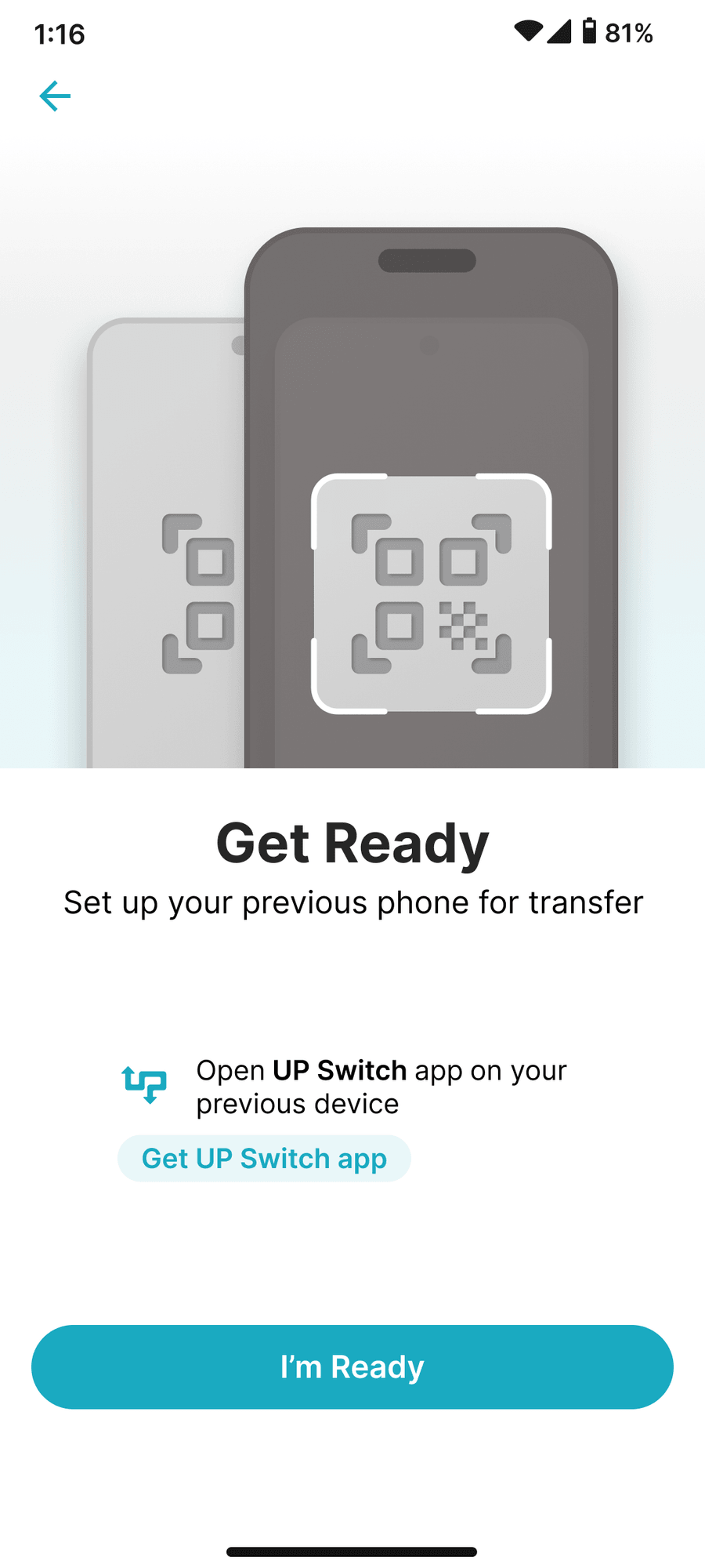
Data migration from a previous device to the UP Phone : contacts, passwords, media, etc.

CHALLENGE
[userFlow]
Welcome app onboarding user flow: boot, unlock, Wi-Fi, firmware, language, region, navigation, lock method, fingerprint, SIM, texting app, T&C, then branch to UP Switch
FLOW
Welcome app Full Flow
use to see more screens
01
Lock screen
The signature Welcome screen sets the tone.
02
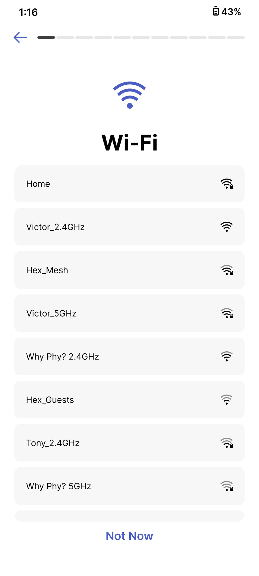
Wi-Fi setup
Connectivity gate: everything downstream needs it.
03
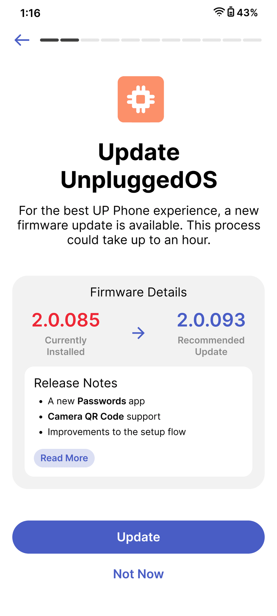
OS update
Folded into setup so day one is the latest build.
04
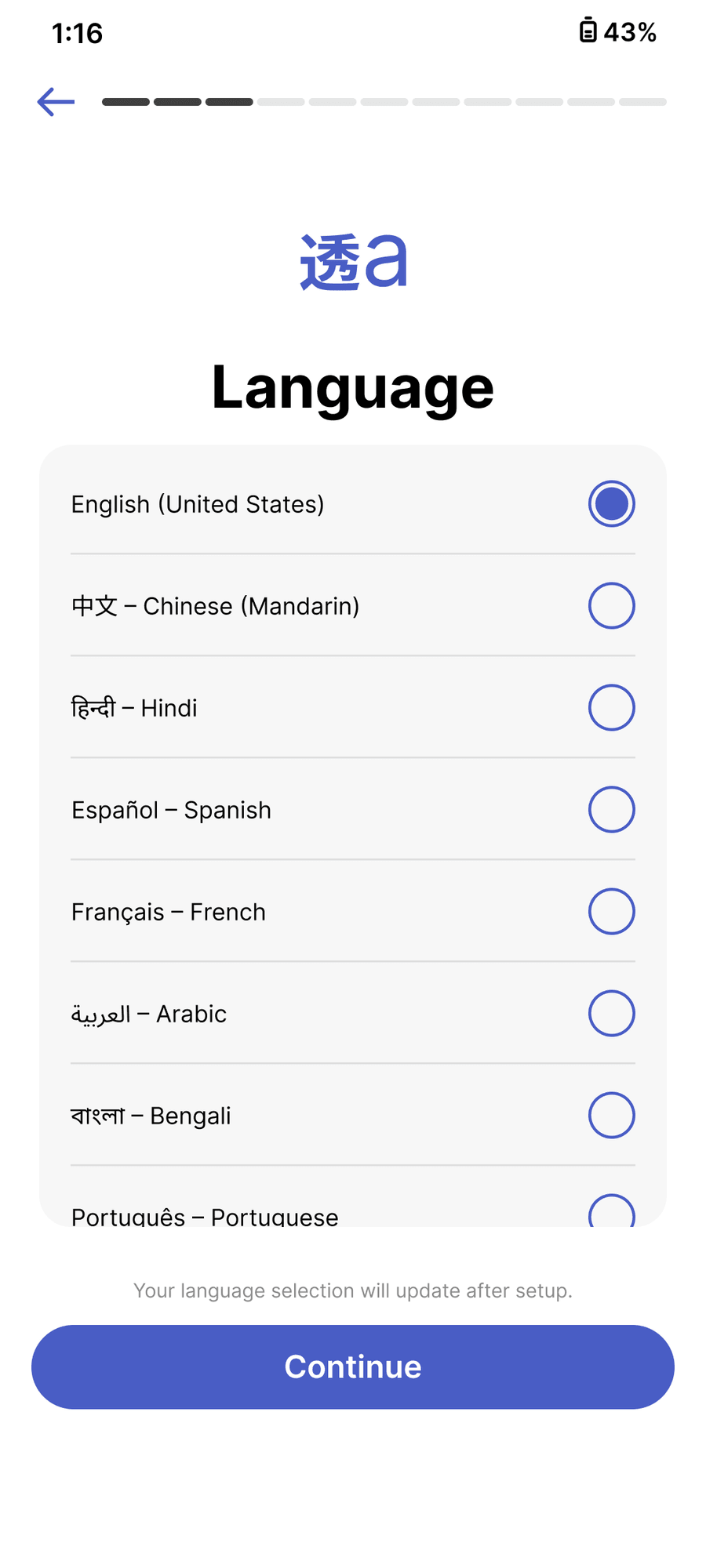
Language
Nine languages up front; re-applies system-wide.
05
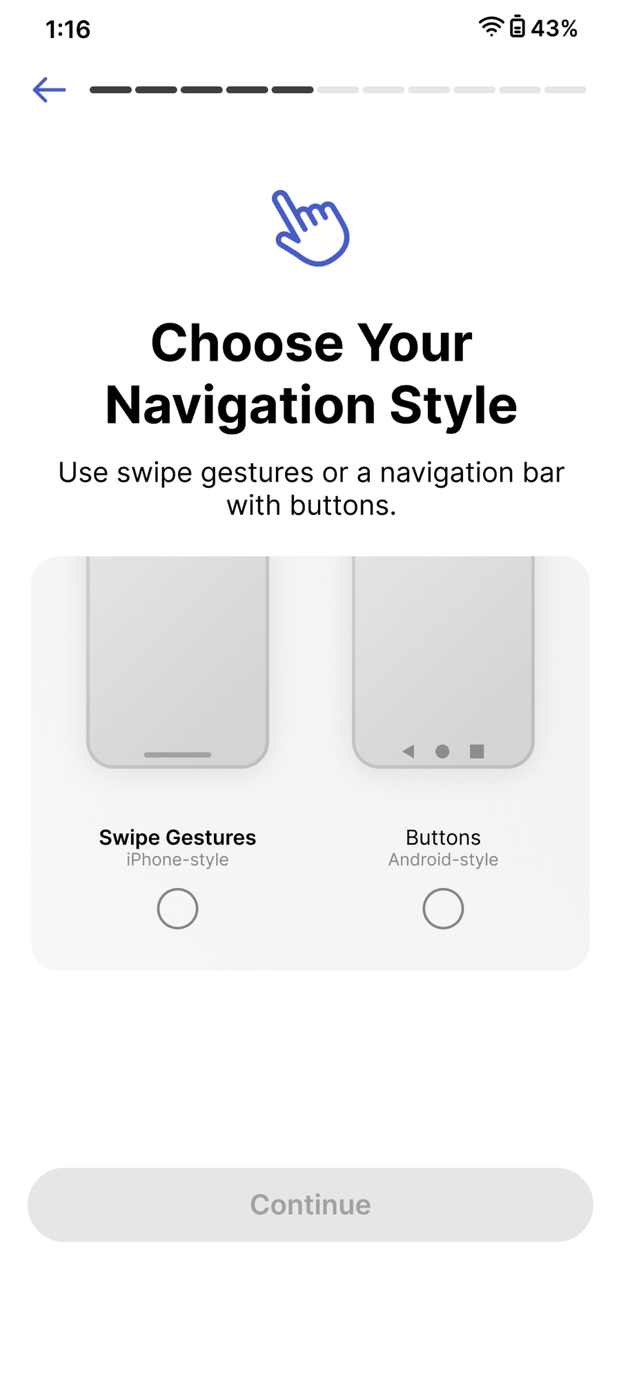
Navigation style
Gestures vs. buttons, with live previews.
06
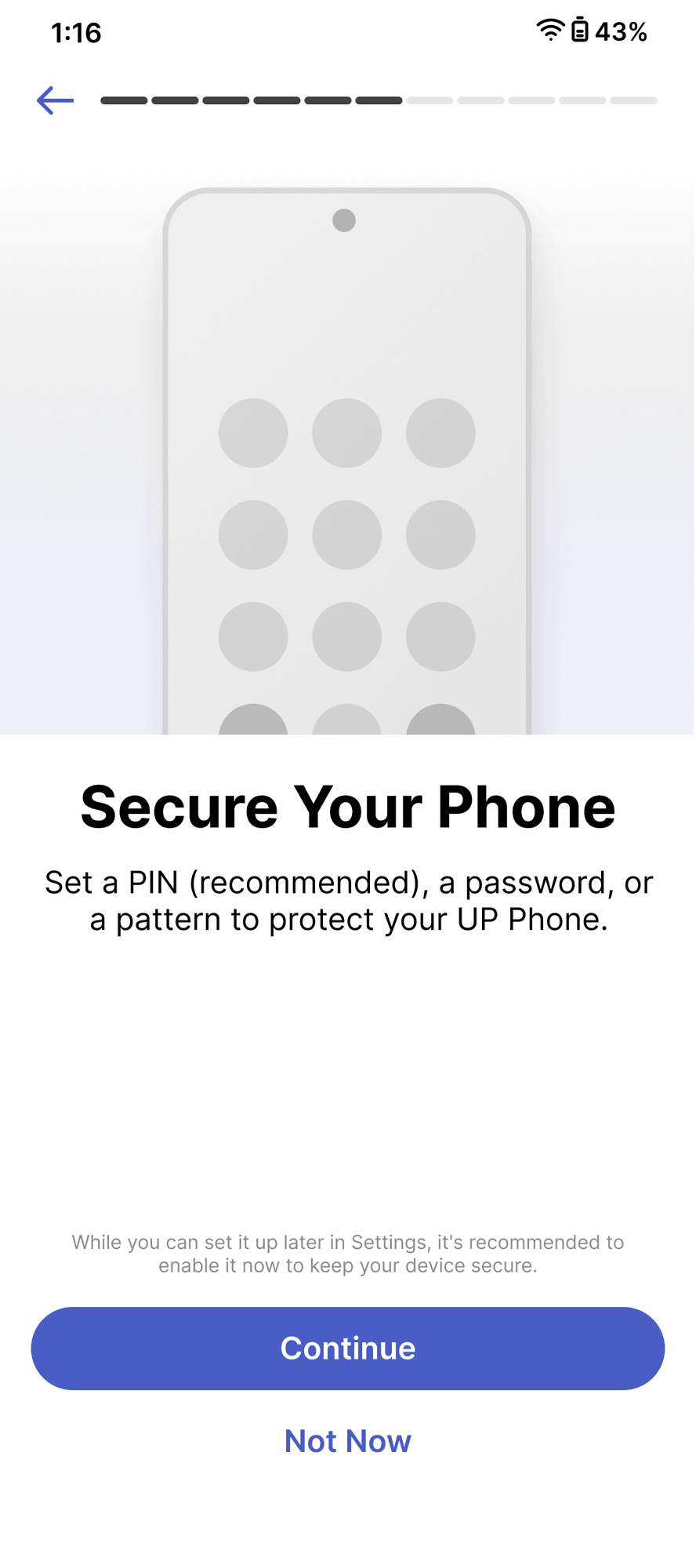
Secure your phone
Security framed as part of the welcome.
07
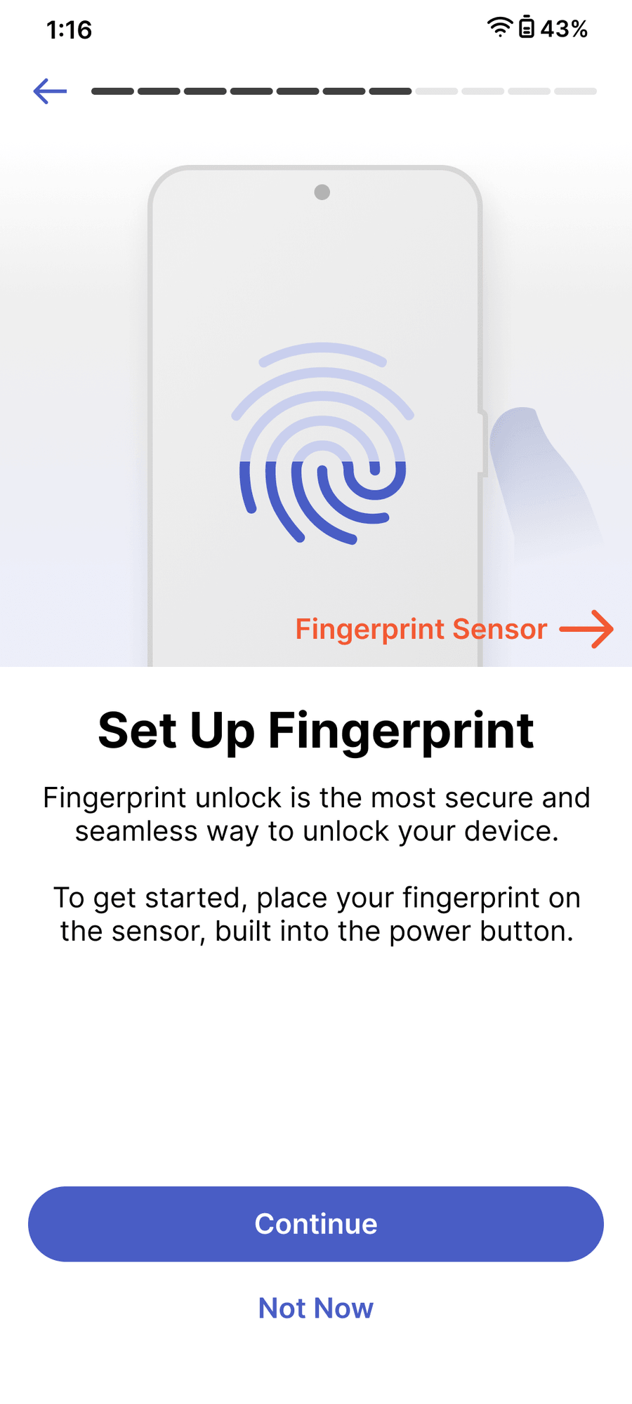
Fingerprint
Optional enrollment, clear path to add later.
08
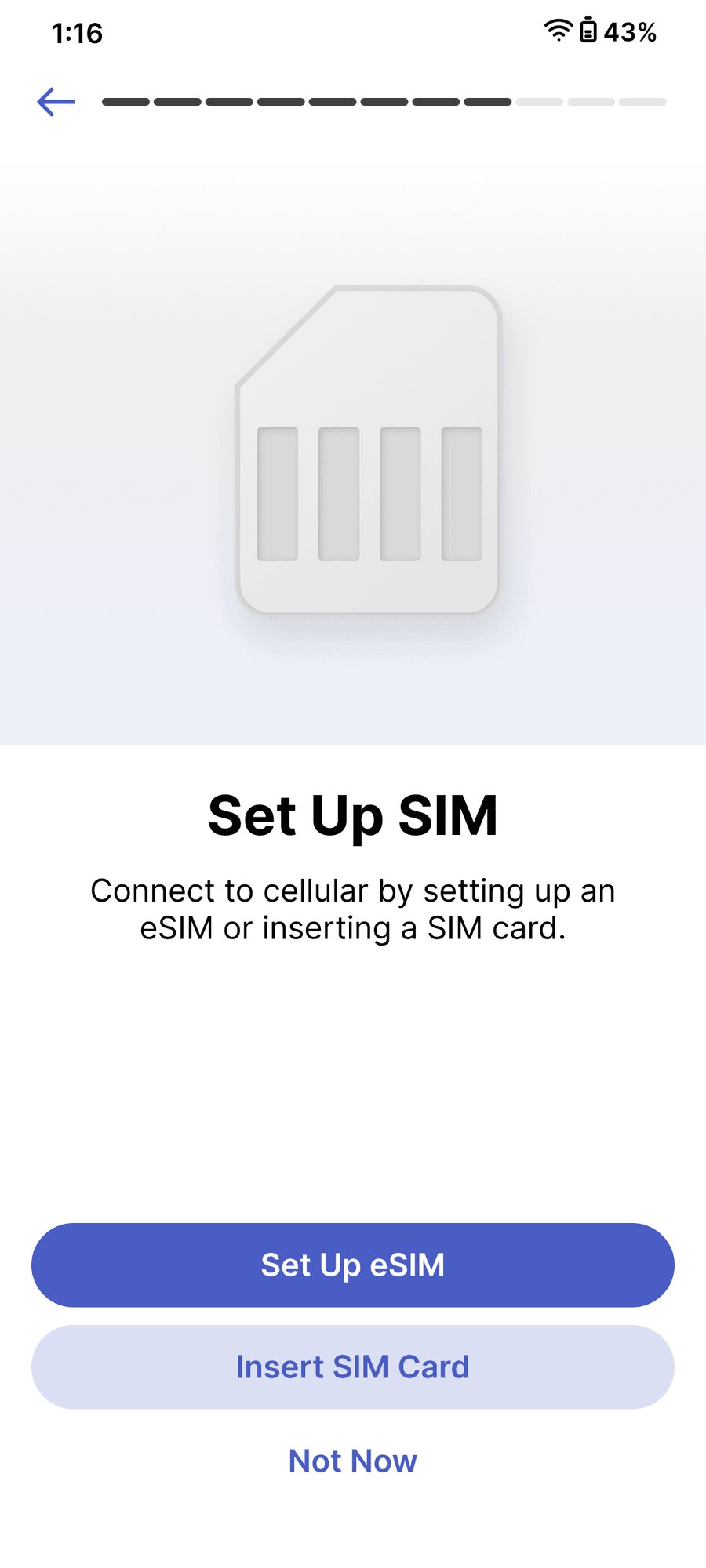
SIM & eSIM
Physical SIM or eSIM, handled inline.
09
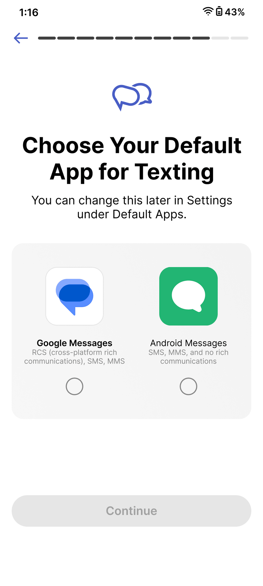
Messaging app
Pick and install the default in place.
10
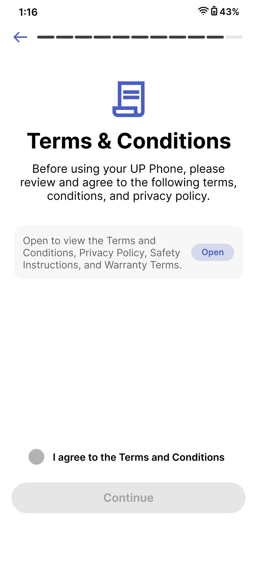
Terms & conditions
Plain-language summary, full text one tap away.
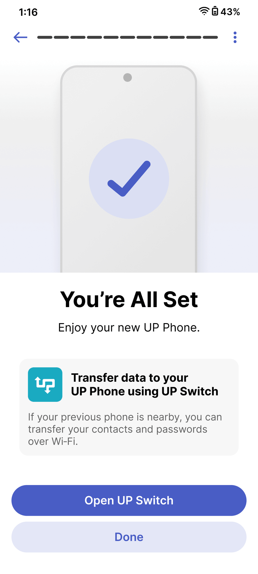
11
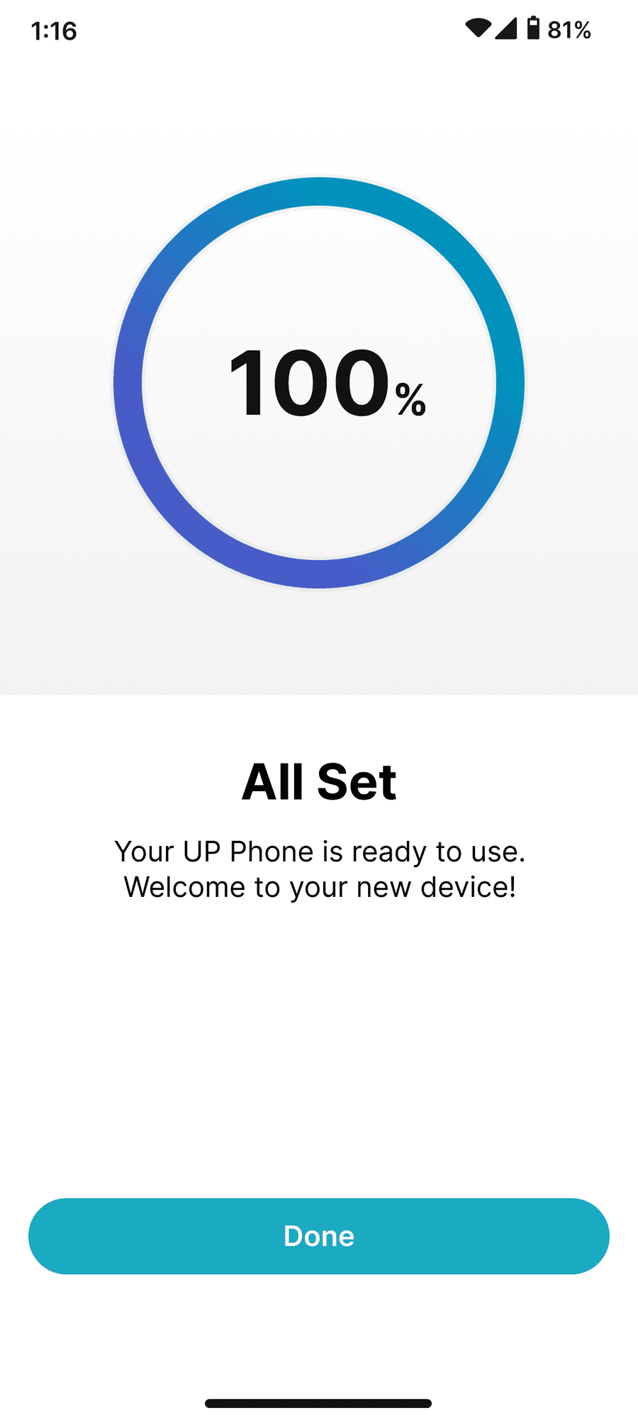
All set → UP Switch
Branch: finish, or hand off to migration.
See the full Handoff Deck
WELCOME
UP Switch app Full Flow
use to see more screens
↙ Receiver
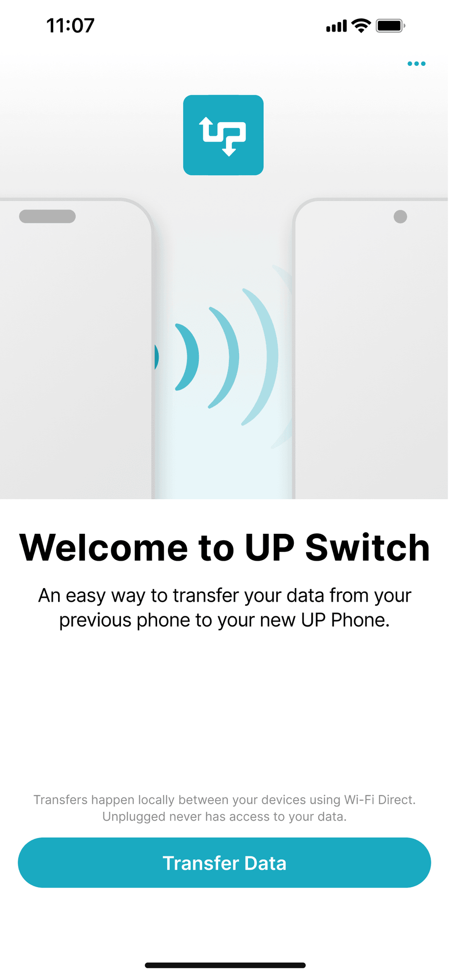
01
Welcome to UP Switch
↙ Receiver
02
Get ready
↗ Sender
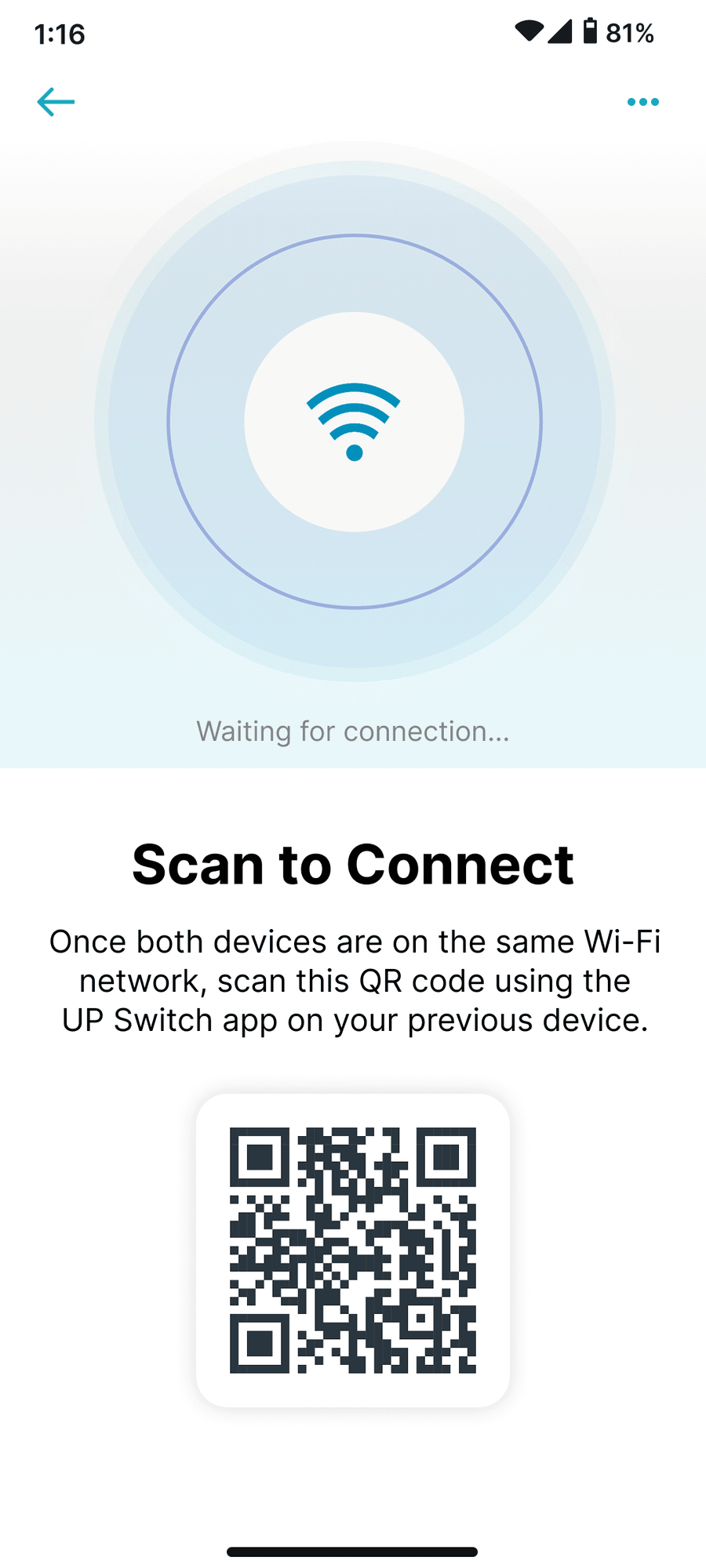
03
Scan to connect
↗ Sender
04
Choose data
↗ Sender
05
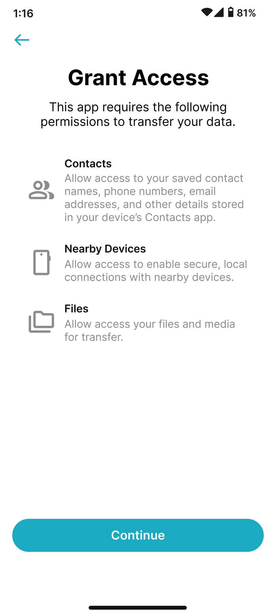
Grant access
↙ Receiver
06
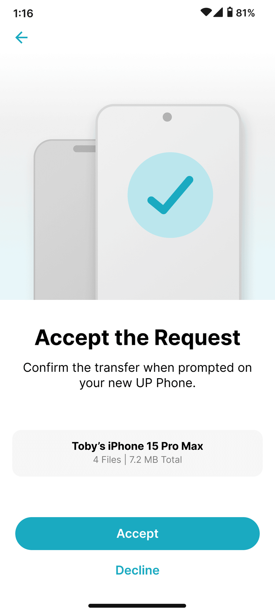
Approve request
↗↙ Both
07
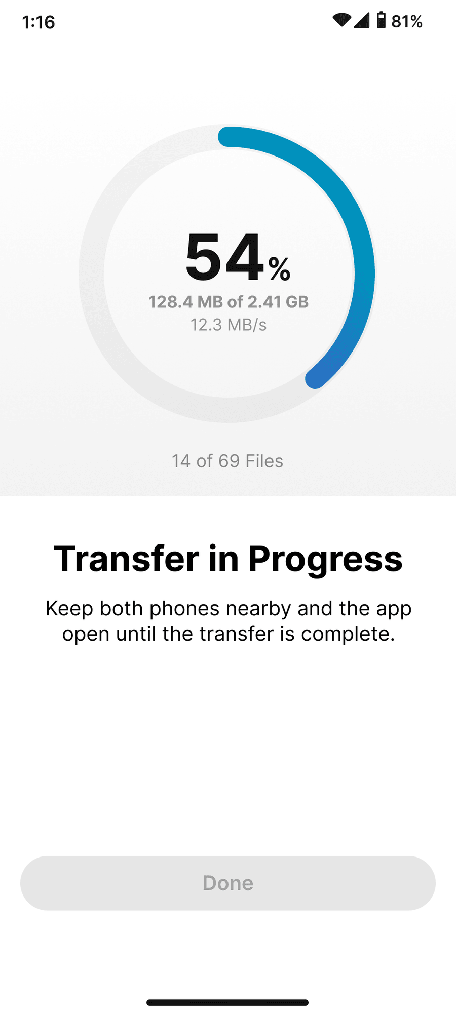
Transfer in progress
↙ Receiver
08
All set
See the full Handoff Deck
UP SWITCH
[Research]

Learning from the phones people already know

Before designing a single screen, I studied the out-of-box setup of the three phones UP Phone owners are switching from: Xiaomi, Samsung and Apple. Not to copy them, but to map what each asks of you in the first ten minutes, and decide what UP Phone truly needs to ask now versus what can wait.

Xiaomi · HyperOS

Messy ordering

The flow jumped around. Takeaway: front-load the easy, low-stakes choices: where you're from, Wi-Fi, language, navigation. Then move to the heavier steps like device lock, fingerprint, SIM and T&C.

Samsung · One UI

Clear, but account-heavy

Not overwhelming, actually pretty clear. But it leans on Google services and forces two mandatory accounts (one Google, one Samsung). Strip those and it's the fastest of the three. Takeaway: don't gate first use behind accounts.

Apple · iOS

Clean, but hides the exits

Clutter-free and clear without reading a word, leaning on a clean old-device transfer. The catch: skip options are hidden. Takeaway: match the calm and clarity, but keep “Not now” visible.

Every step had to earn its place
01Fast 02Required 03Easy 04Familiar + Apple-inspired calm
See the full wireframes deck →
RESEARCH